The film was definitely a learning experience. It showed the passion in which fellow artists and designers have for Type. Being there using, touching and being apart of the process of creating print and graphics with physical woodcut type, machine presses is surely a real eye opener. It shows the disconnect we as designers will have to contend with, with the increased use of computers and their playing a major role in design work today.
It would be awful to see the museum fade away as some of the original crafts people get older. The one guy seems to be the leading force in keeping the museum open and maintaining the all the type stock. It would be great to see a larger afford by artists and designers all over the country keep this place up and functional. And although it possibly wouldn't appeal to a majority of people (non-artist/designer). A small community of followers would love to travel to the museum take part in sometime historic to a profession. I would hope it will continue to be attraction for designers presently and for future generations. It would definitely benefit from more and more advertising nationally.
Wednesday, May 25, 2011
Industry_Arts & Crafts


The Industrial Revolution seemed to have taken the world by storm and greatly improved the methods in which almost everything was done. These improvements also spread through the printing and art and graphics world. Photograph made its way onto the stage and gradually transformed the way in which people viewed their landscape, events, as well as other people. Printing, Print Graphics and other artistic professions benefited from the Revolution as well. A surge in printing and publications etc, catapulted some of these industries into national brands, and as these printing companies as well as other industries grew, the demand for more output, mechanization and people increased as well. Along with the increase in production, the quality of work also improved, this in-turn produced much better products which increased demand as well. The Industrial Revolution was like the innovative/technical renaissance for the world, it definitely helped to bring about the world we live in today and the graphic design world would not be what it is today without that period of innovation.
Images: http://adlhochcreative.com/blog/?tag=joseph-niepce /
http://morrisedition.lib.uiowa.edu/storyglitteringplain.html
Sunday, May 15, 2011
Creative Brief II
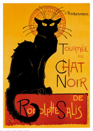
Identification: Created by Theophile Alexandre Steinlen in 1896, The poster entitled "Tournee du chat noir" was one of his first Paris commissions for Le Chat Noir. This particular poster is but one of several cat poster he created for the 19th century cabaret.
Project: The purpose of Steinlen's work on this poster was simply for advertising of the cabaret. Advertising of Le Chat Noir, Salis and Aristide Bruant. A frequent performer and singer at the cabaret.
Client: The client of this project was Le Chat Noir. French for "The Black Cat". This was a 19th century entertainment club or cabaret based in Paris, France in the Bohemian Montmartre district of the city. It was own and operated by Rodolphe Salis.
Intended Audience: The intended Audience was mostly french men and or any passerby. The status of the club slow grew over the years and expanded it's audience to foreigners whom were in Paris. According to Rodolphe Salis, "The Chat Noir is the most extraordinary cabaret in the world. You rub shoulders with the most famous men of Paris, meeting there with foreigners from every corner of the world."
Core Message: The core message is very direct. A black cat! "The Black Cat" Le Chat Noir. It gets to the point of the message almost instantly. Specially if you are a frenchmen living in Paris or almost anywhere in France during the 19th century when word of this night club is spreading around.
Graphic Strategy: The graphic strategy used for this poster is simple yet extremely affective. Le Chat Noir, The Black Cat. Steinlen places a black cat on the poster dominating a large portion of space on the poster. He also uses nice fairly bold contrasting colors, that compliment the large black cat. As well as Decorative text with black beginning letters.
images: http://www.allposters.com/-sp/Tournee-du-Chat-Noir-c-1896-Posters_i314154_.htm
images: http://www.allposters.com/-sp/Tournee-du-Chat-Noir-c-1896-Posters_i314154_.htm
Durer Rhino

Out of all the imagery that we covered over the week, I found this image to be one of the most interesting. Created by master artist Albrecht Durer from a sketch and description sent from Spain. He created this woodcut illustration of what he thought a rhinoceros would have looked like. Appearance wise, this rhino's skin plating is very different compared to the modern rhinoceros we are so familiar with. The body shape is practically the same. I just find it interesting that a man who has never seem a animal such as this, was able to draw it so accurately. The fascinating idea about this illustration is that what if the rhino really did look like this. An earlier evolution of the species, seen by humans and not too old on the Prehistoric and Geologic Timeline.
Images: http://phthiraptera.blogspot.com/2009/12/foure-footed-beastes.html
Wednesday, May 11, 2011
Creative Brief
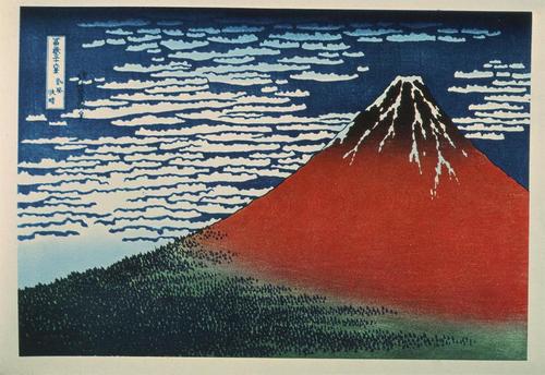
Identification: Created by Katsushika Hokusai between 1830-1832. This woodcut print entitled South Wind, Clear Dawn is just one in the series of prints called Thirty-Six Views of Mount Fuji. It is also known by the name, Red Fuji.
Project: Just one in the series Thirty-Six Views of Mount Fuji. This print was designed to show Japan's cultural landmark in all of it's beauty and natural essence. When in series, this and the remaining prints "depict the external appearance of nature and symbolically interpret the vital energy forces found in the sea, wind, and clouds."
Client: There is no specific client of this print. It was not made for any one person or government. Instead, it is a piece created for the people. It was created to show the landscape and one of the peoples most cherished landmarks.
Intended Audience: The intended audience of this particular print was undoubtedly the people of Japan. The Japanese people have a deep spiritual and cultural connection with Mt. Fuji. It is a symbol of their ancient culture and it is considered one of their three "Holy Mountains".
Core Message: The core message of this print is to "capture the essence of the mountain, in this simple yet powerful vision". To display the mountain in all its glory, surrounded by the natural world. It depicts what the early japan culture would see as the sun rises and the light hits the peak of the mountain.
Graphic Strategy: Hokusai used rich distinct colors to show the different layers of the separation between the land , mountain and sky. The red shows the first signs of sunlight hitting the peak of the mountain, bathing it in a red glow while the base of the mountain and landscape surrounding it remains in shadows of night.
Images by: http://www.proprofs.com/flashcards/upload/q4556392.jpg
Also check: Megg's History of Graphic Design, Fourth Edition pg.193 (11-5)
Also check: Megg's History of Graphic Design, Fourth Edition pg.193 (11-5)
Thursday, May 5, 2011
Early Civilization

It is interesting how it can be said that modern design can trace its origins back to early cave drawings. The pictogram above is one of the earliest cave drawings found. From these paintings to the Sumerian writing and all the way down to the Egyptian hieroglyphics. They are all tied together in their
ability to have influenced future civilizations. As civilizations developed throughout the ancient world, these cultures slowly developed the techniques pasted down to them from their ancestors and perfected it to their benefit, giving raise to early written language. The Egyptians being the first to combine both imagery and writing into their documentation of events at the time. This gives one an idea of the genesis of what we call design.

Subscribe to:
Posts (Atom)